Product Detail Page Example
8-figure cosmetics brand
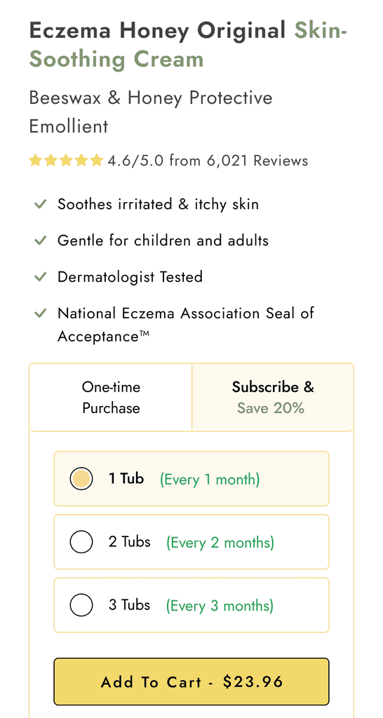
This cosmetic brand approached us after we were recommended by their ad agency. There was suspicion that on-site performance was leading to a sub-optimal MER, so we were happy to help.
We completed an audit of the entire on-site customer journey and highlighted several areas that could be significantly improved.
By the end of our engagement, we had increased conversion rate while also increasing AOV, resulting in a huge win for them... without a cent more spent on ads.
AOV
Boosting
Offer
More persuasive copy
Clearer
CTAs
Landing Page Example
Hyper-growth supplement brand
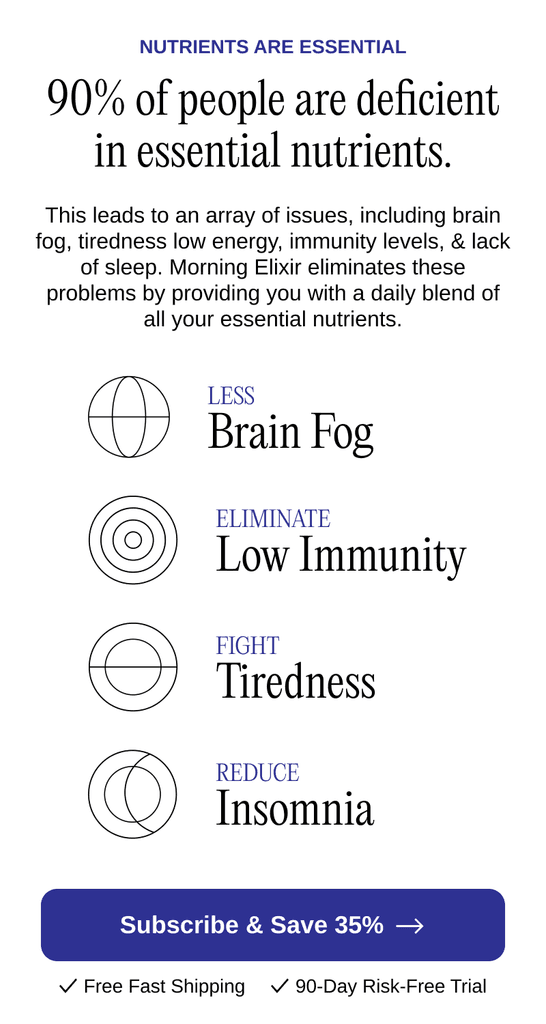
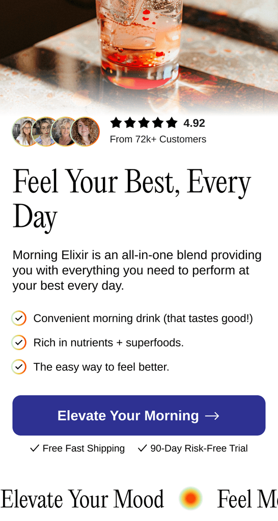
A fast-growing brand reached out to us with the goal of improving their on-site performance, particularly when driving traffic from Meta. Their existing setup was underperforming, and they needed expert insights to turn things around.
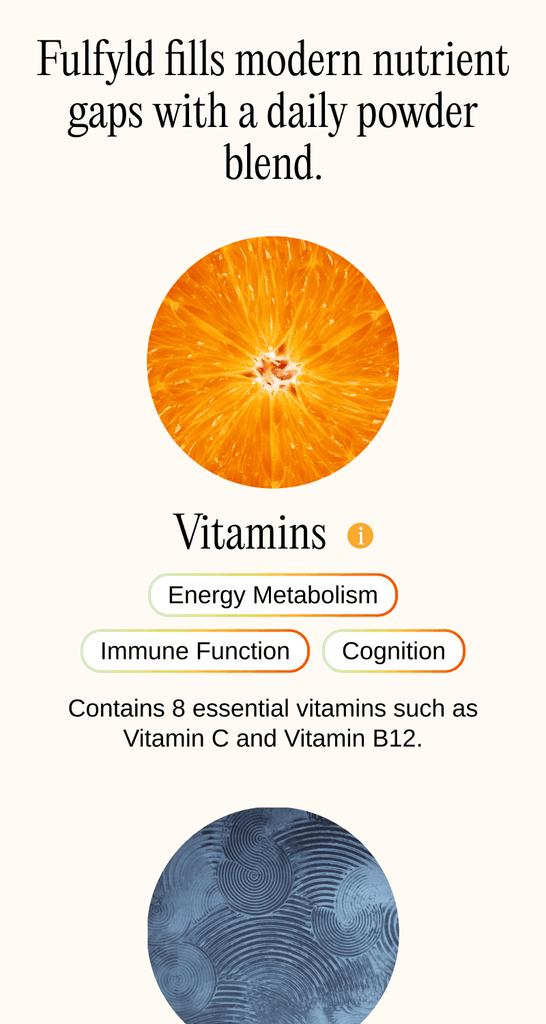
Our analysis uncovered several critical areas needing attention, notably the unclear USP and the lack of clarity about the product itself. To address this, we designed and implemented an extremely on-brand landing page that clearly communicated their USP and product details.
The improvements were substantial. The new landing page not only clarified the product offering but also resonated strongly with their target audience.
Clearer
USP
Enhanced
readability
Improved
offer
Bundle Example
Woman's Health Brand
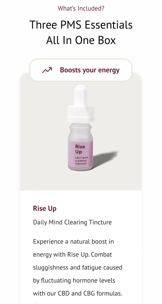
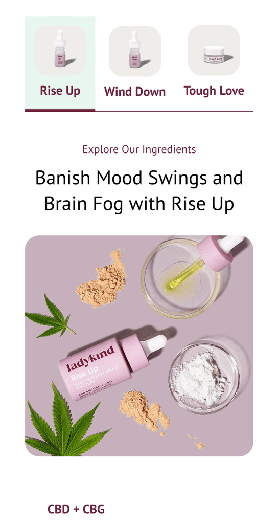
A women’s health brand’s ad agency contacted us with concerns about their website, which was built by another design studio. The site was visually appealing but challenging to navigate and wasn't driving results.
Our audit found the same - essential content was hidden in tabs, scattered across different pages, and some features were broken.
To address these issues, we started by completely re-designing the page for their most popular bundle.
The results were impressive. As a result of improved usability and a conversion-focussed design, they found AOV and CVR increase hugely.
Improved
bundling
Usability enhanced
Injected clarity
